
Last updated: First published:
On a Trip to the Text Morphology Clinic
Hello, and welcome to this episode of Fun with View Transitions, where we diagnose and improve text morph animations in the view Transition API!
Join Dr. Bag on patient rounds as we examine common ailments affecting text transitions, apply diagnostic techniques, and prescribe effective treatments.
Our treatment plan:
- Initial assessment
Identifying key symptoms and underlying causes. - Structural analysis
Using advanced diagnostic tools to pinpoint issues. - Targeted intervention
Applying the most effective fixes for smooth transitions. - Preventative care
Establishing best practices to avoid future complications.
Below, you’ll find before-and-after images illustrating both the severity of the condition and the remarkable potential for recovery.
For the best experience, follow along with the exercise repository↗.
Now, let’s begin the patient rounds!
In the last episode, we added morph animations all over the place. However, I nudged you away from applying the default morph animation to text element and instead suggested a spiffy shift animation as an alternative.
That wasn’t meant to discourage you from using text morphs! They just require a bit of background knowledge to get them right.
Lets start by diagnosing the issues in the first video above.
- Clicking the link morphs it into a headline with the same text, but during the transition, the text bloats immensely.
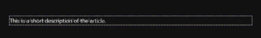
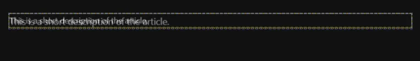
- The one-line description remains identical on both pages but doesn’t stay aligned while morphing.
- Content that grows or shrinks horizontally ends up overflowing vertically during the transition.
- The headings look different, but both begin with “The Morphological Clinic.” Can we align them?
Some effects might surprise or annoy you, while others you might seem perfectly fine as they are.
Don’t get lost in perfectionism when fine-tuning your animations. Not every transition needs to be pixel-perfect during the whole animation. A bit of blurring from the cross-fade can even enhance the effect and make the animation more natural.
Also, keep in mind that some glitches become less noticeable at higher animation speeds. View transitions are meant to be fast, and while you might be fascinated by them, your users care more about a quick and responsive experience than watching every frame of an animation play out before they can continue. Since interactivity is limited during a view transition, it’s best to keep animations brief so users aren’t left waiting. Most users won’t even notice minor glitches in a fast transition.
That said, let’s take a closer look to understand exactly what’s happening!
To make the effects more noticeable, the animation duration in the video above is five times longer than the default. Increasing the duration can be a simple yet effective way to examine view transition animations in greater detail.
For better flexibility, use inherit where possible instead of setting fixed durations. This allows you to adjust the speed of all animations with a single CSS rule:
::view-transition-group(*) { animation-duration: 5s;}This rule applies the longer duration to all group pseudo-elements, and the animations for both the old and new elements can inherit from these settings, ensuring consistency.
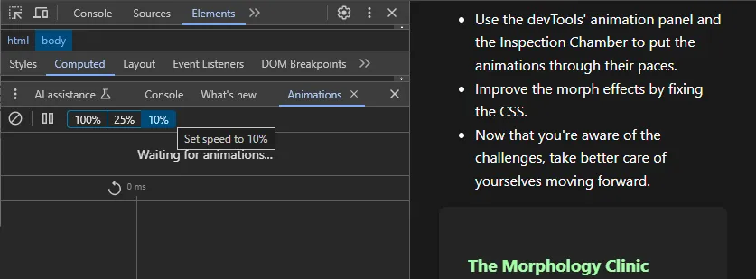
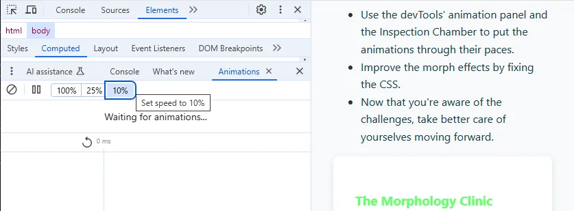
A more effective way to analyze animations is to use the browser’s developer tools. In the animation panel, you can slow down animation speed by selecting predefined percentage values.
Stepping through animations requires a bit of explanation. First, click the pause button (⏸) in the animation panel to wait for the next animations. Then, trigger a view transition by clicking a link or button on your page. At first, it may seem like nothing is happening, but the animations have been recorded. To view them, select a recording from the timeline band below the pause button. In the associated diagram, you can move the slider forward and backward through time to inspect each frame of the transition. When you’re done, don’t forget to hit play (▶), or the browser may appear frozen indefinitely.
When I first delved deeper into view transitions, I found myself wanting even better diagnostic tools. Admittedly, crafting such a tool also teaches you a a thing or two about the inner workings of view transitions. So, it’s a clear win-win-win. I learned a lot, and now I can share both my knowledge and the tool with you.
The Bag’s Inspection Chamber is a developer tool designed specifically for view transitions. It offers stepless slow motion and random navigation through the animation timeline, allowing you to focus on specific transition groups. Additionally, it provides options to outline pseudo-element geometry and selectively hide elements, making it easier to analyze complex transitions with greater clarity.
The Bag’s Inspection Chamber is a developer tool designed specifically for view transitions. It offers stepless slow motion and random navigation through the animation timeline, allowing you to focus on specific sets of transition groups. Additionally, it provides options to outline pseudo-element geometry and selectively hide them, making it easier to analyze crowded transitions with greater clarity.
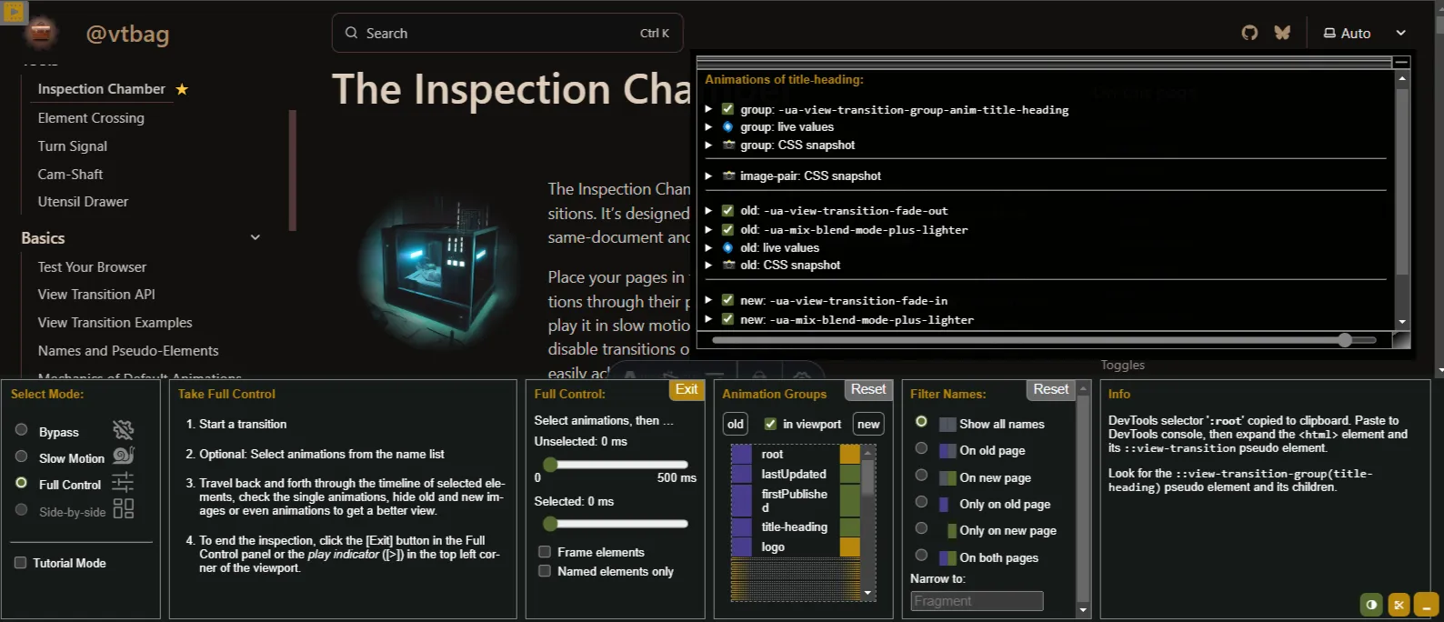
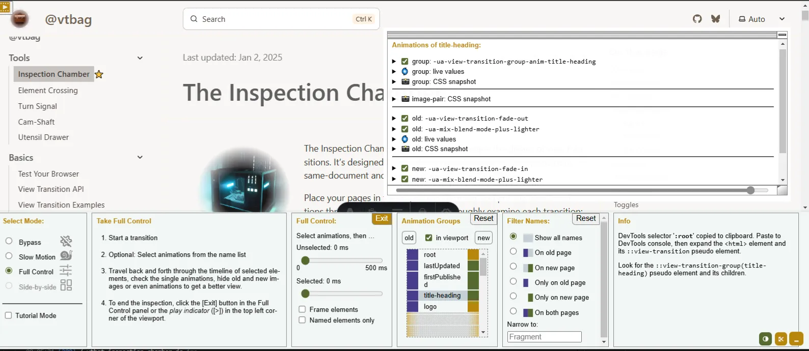
Outlining and hiding elements will come in handy when diagnosing animations in detail. If you follow this episode on fun-with-view-transitions.pages.dev↗, you will find the Chamber preinstalled, along with a short introduction on how to use it.
Use these diagnostic tools to thoroughly examine your animations and identify the problem cases affecting your site. Put them through their paces and see what they’re suffering from!
Clear Diagnosis based on Unmistakable Signs
Section titled “Clear Diagnosis based on Unmistakable Signs”Unexpected bloating is a very common phenomenon that affects nearly all users of the View Transition API when morphing texts with different aspect ratios. It manifests as an abrupt, visually jarring text morphing effect, often resulting in unnatural scaling during transitions. These symptoms can be disorienting, particularly when they look like large font size changes. Despite its disruptive appearance, the issue is non-critical and can be fully mitigated. With proper implementation techniques, developers can reliably prevent recurrence, ensuring smooth and readable text transitions.
- The default morph animation works well with text as long as you cross-fade areas of the same width.
- Morph animations interpolate between the old and new images’ geometry, which may result in passing through different aspect ratios. This can cause unexpected scaling or even distortion.
- If you expect text to remain crisp and clear during a morph animation, the old and new images must be identical. Even slight differences can cause issues.
Even though the effect is most often observed with text morphs, it is not unique to text morphs. It is likely to happen with any morph animation where the images have different width and different aspect ratios.
And off we go with the treatment!
Morphing from a link to a title with the same text on the next page is a classical fail. The reason for this becomes clear when we examine the bounding boxes of the pseudo-elements during the transition:


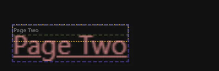
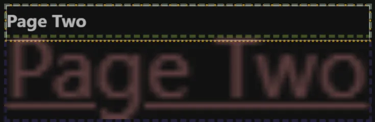
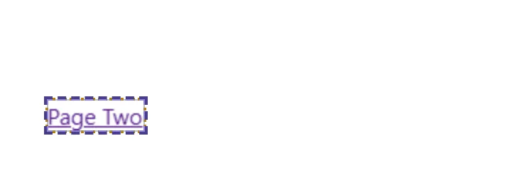
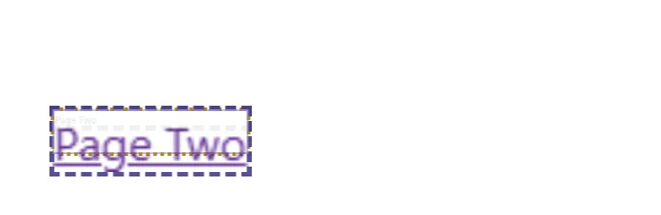
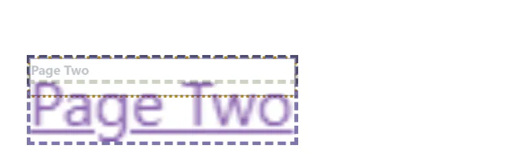
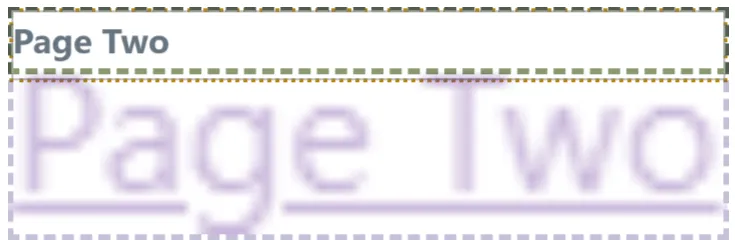
The first picture above shows the old image of the link text within its purple frame, which tightly fits the content. The last picture shows the same text as a title inside its green frame, which extends to 100% of its container. This is much wider than the text itself.
The default styling for morph animations causes both images to transition from the width of the old image to the width of the new image, adjusting their height to keep the original aspect ratio.1 As a result, the small link text is enlarged to cover the whole width of the page before it fades.
One solution to this problem is to ensure that the new image also fits the content without any extra space. Even better, ensure that your identical texts have identical styling, including spacing and font features. Since the transition happens quickly, it doesn’t need to be perfect, just good enough.
You don’t need to have the exact same styling for a link and a heading on your site. To cure the broken link animation, we switch the heading’s styling from block-level to inline. This ensures that both elements match more closely during the transition, preventing unwanted stretching.
h2 { display: inline-block;}Alternatively, we could have set the width of the block-level heading to fit-content.
You can find a more in-depth analysis of this common glitch and its remedy in the examples section on this site.
Alternatively, you could change the morphing behavior that is the root cause of the irritating effect we saw. We use that recipe to cure the different aspect ratios of the description text. While the texts and font properties are identical, the images differ because their paragraphs have different width. On Page 1 the description is within the card, whereas on Page 2, it is wider because it is outside the card.
Setting the images’ width to match the width of the group-pseudo container scales them differently, leading to misalignment during the morph.
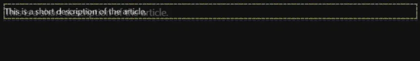
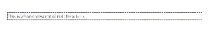
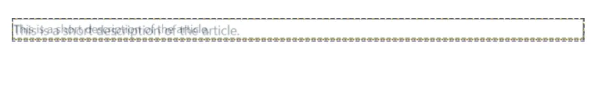
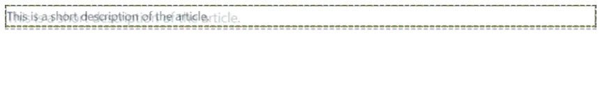
So, instead of making the images same width, we can make them same height and let the width be calculated automatically to preserve the original aspect ration:2
::view-transition-old(description),::view-transition-new(description) { height: 100%; width: auto;}This adjustment helps align the images more accurately, preventing unwanted scaling effects. It works effectively in our case because both images contain the same text and the same number of lines.
Aligning the Aspect Ratios During Animations
Section titled “Aligning the Aspect Ratios During Animations”Can we use this trick also if the two texts have different aspect ratio? Definitively! This makes for a nice effect for inline elements where the texts have the same initial part:
Can we use this technique even if the two texts have different aspect ratios? Definitely! This approach works particularly well for inline elements where the texts share some common content:
The animation above starts with the shorter old image (purple frame) and cross-fades to the wider new image (green frame). The yellow frame represents the group that grows from the smaller to the greater width. The effect is that the initial part of the text remains visible while the trailing part fades in.
We can remove the fade animation and instead clip the images at the border of the group, resulting in a more visually interesting and engaging effect.
::view-transition-old(content),::view-transition-new(content) { animation: none; /* removes the fade animations */ block-size: 100%; inline-size: auto;}/* Do not let the content overflow the animation group */::view-transition-image-pair(content) { overflow: clip;}/* Drop the images of the shorter versions */.page2::view-transition-old(content) { display: none;}.page1::view-transition-new(content) { display: none;}Once again, we set the height/block-size to 100% and the width/inline-size to auto. animation: none removes the fading animations for both the old and new images. On transitions to Page 2, we only show the wider new image, while transitions back to Page 1 show the wider old image. Here page1 and page2 are CSS classes on the :root elements of Page 1 and Page 2, respectively. These classes were introduced for the sake of simplicity, making it easier to support page-dependent styling in our exercises.
Switching off the smaller image is a subtle adjustment to avoid the over exposure effect of mix-blend-mode: plus-lighter. Nobody would notice that during a view transition. But as y’all now examine the animations frame by frame using the Chamber, I want them to be perfect. For a preview of the result, see the “after” video above.
Extending the image to the right while the aspect ratio changes is merely one treatment for this condition. You may have developed your own strategies for managing varying aspect ratios, perhaps employing object-fit and object-position as part of your approach. For additional insights and alternative methods, I strongly recommend consulting Jake Archibald’s excellent article on Handling aspect ratio changes↗, which provides valuable recommendations and techniques for this common challenge!
The last patient for today is the green single-line heading morphing into the large two-line heading. What you are observing is the result of applying height: 100%; width: auto to two images that do not have the same logical height. Here, the number of lines differs between the two images.
Clearly, the initial parts of the two images would align nicely, if we could modify the default animations to have the smaller image end up in the upper left corner of the larger one. The question now is: Can this be done?
Here’s the prescribed solution:
::view-transition-old(header),::view-transition-new(header) { height: 100%; width: auto;}/* When going from Page 1 to Page 2keep the browser generated fade-out, but add a shrink animation to the old one line image */.page2::view-transition-old(header) { animation-name: shrink, -ua-view-transition-fade-out, -ua-mix-blend-mode-plus-lighter;}/* When navigating from Page 2 to Page 1keep the browser generated fade-in but add a grow animation to the new two line image */.page1::view-transition-new(header) { animation-name: grow, -ua-view-transition-fade-in, -ua-mix-blend-mode-plus-lighter;}::view-transition-group(header) { animation-timing-function: ease-in-out;}@keyframes grow {from {height: 50%;} 80% {height: 50%;} to {height: 100%;}}@keyframes shrink {from {height: 100%;} 20% {height: 50%;} to {height: 50%;}}After administering that treatment, the patient is now in good health, as you can observe for yourself in the video above.
When crafting new morph transitions, an ounce of prevention is worth a pound of cure.
Morph animations will yield the best results when:
- The elements being morphed have identical content and aspect ratios, ensuring smooth motion and proportional size changes…
- …and the images involved are smaller than the viewport
When dealing with text morphs, remember that you’re morphing images of text:
- If the text images don’t align correctly, investigate padding, alignment, borders, and font features to ensure consistency.
- Because they are just images of text, text wrapping will not automatically adjust to size changes during the animation, potentially causing misalignment.
- Defining both width and height of the text image with fixed values, without using
auto, may lead to stretching and distortion of the text. - Use
object-fit,object-position, scaling and other transformations to control which parts of the pseudo-elements should be displayed, and how.
The visual appeal of text morphs can also be influenced by the layout of the elements and line breaks:
- Evaluate your animations at various viewport sizes, paying particular attention to the alignment of the text fragments to be morphed.
- Consider using viewport units for font sizes in headings to force consistent line breaks across different devices (or avoid breaks altogether), e.g. for headings.
- In some cases, morphing several smaller elements may be more appealing than morphing one larger element. For example, transitioning from a card component to an article looks smoother if individual elements, like the title, date, tags, and author, morph independently.
- Conversely, morphing one large section may sometimes yield a smoother transition than attempting to morph multiple smaller sections with varying content sizes.
Finally, cross-fades are not always necessary:
- There are alternative, visually appealing animations for changing text content.
- Also consider crafting animations where either the old or new image is removed entirely, which can simplify the transition and enhance the visual flow.
I sincerely hope you’re feeling a bit better now and that these remedies have alleviated your worst symptoms! If your case requires further examination, don’t hesitate to seek a specialist’s opinion—I’m available for consultation on Bluesky. Until our next appointment, keep animating, keep experimenting, and most importantly, keep having fun… with view transitions!
-
Technically, the effect is determined by the extent in the inline direction rather than strictly by width. In horizontal writing mode, this corresponds to the element’s width, while in vertical writing mode, it applies to its height. ↩
-
The given definition assumes a horizontal writing mode. To accommodate vertical writing modes as well, use
inline-sizeinstead ofwidthandblock-sizeinstead ofheight. ↩