
Last updated: First published:
Add Native View Transitions to Your Starlight Site
Hello, Astronauts, and welcome to a very special episode of Fun with View Transitions, where we make the stars twinkle in a smooth new light!
See how we sprinkle some browser-native, cross-document view transition magic on your Astro Starlight site.
Get it all automatically by installing the pre-configured
…or take the full walkthrough below!
In this episode, we’re not starting with videos, but with a glimpse of the Starlight Starter after the enhancements:
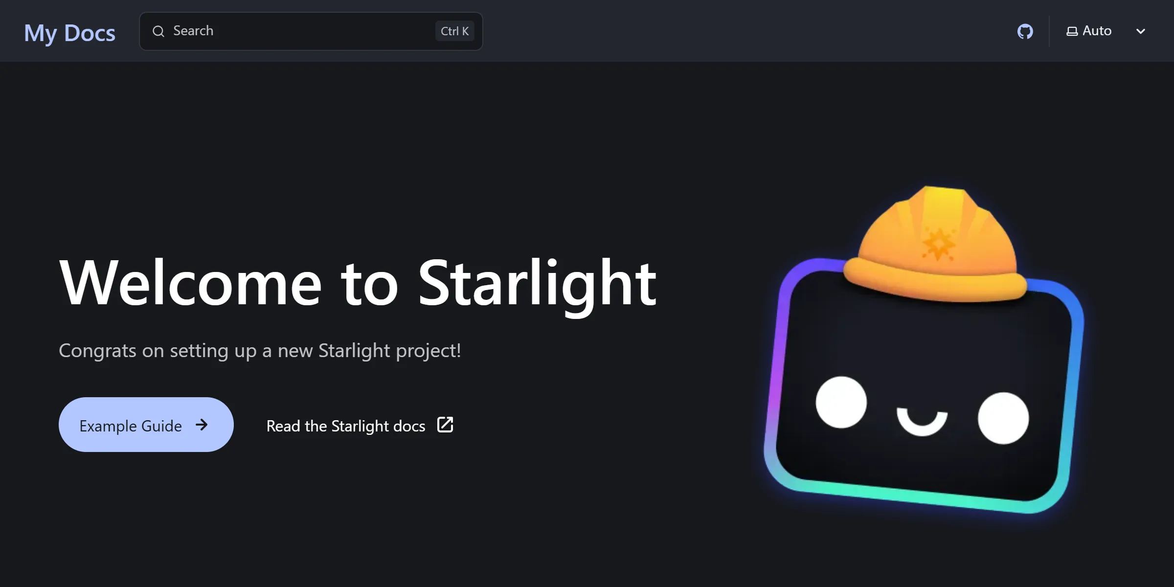
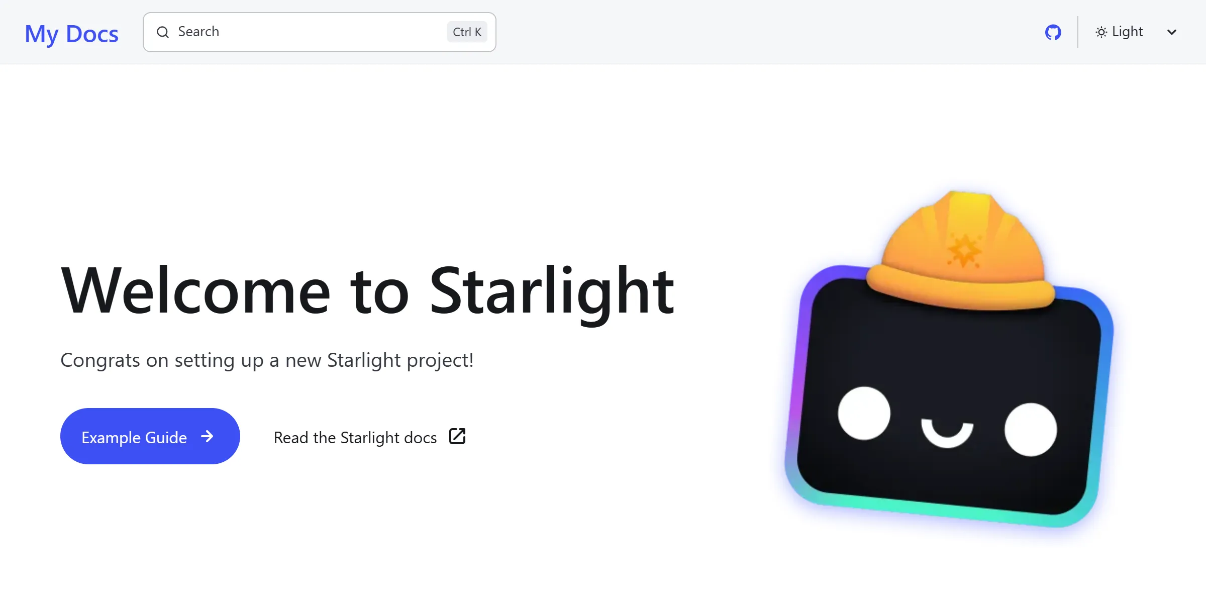
Of course, with the plugin, the way the effects are initially customized is opinionated. You get a proven setup that balances stability and flexibility, ready to use as-is or tweak to your liking.
For the best experience, follow along with your own Starlight site or with the exercise repository↗.
Nearly a year ago, I wrote a step-by-step guide↗ on using Astro’s <ClientRouter /> component (formerly <ViewTransitions />) to give a Starlight site that SPA-like look and feel wih view transitions.
This time things are different: As you’d expect from vtbag.dev, this is not about Astro’s client router. We are going browser-native! Works in browsers with native Level 2 view transition support.
The steps we take are not specific to Astro, and some will be old acquaintances from earlier Fun With View Transitions episodes, now applied directly to your Starlight site.
Launch sequence:
- 6️⃣ Enable view transitions while respecting reduced motion preferences
- 5️⃣ Animate the main section, page title and navigation entry
- 4️⃣ Determine view transition types for direction based page order
- 3️⃣ Prevent pseudo-smooth-scrolling on scrolled pages
- 2️⃣ Fix stacking order issues during view transitions
- 1️⃣ Wait for page content to load before starting view transitions
- 0️⃣ Lift off 🚀
Let’s reach for the stars!
I recommend installing the astro-vtbot Starlight Plugin including the two optional steps. The plugin takes care of everything described on this page automatically. No extra steps are required.
You can then read the rest of this episode as a walkthrough, breaking down each part so you know exactly how to customize it for your own needs. I won’t keep reminding you in every paragraph, “This is only required if you didn’t install the plugin.”
Alternatively, don’t install the Starlight Plugin. You can then follow along and treat this episode as a step-by-step guide, implementing each part manually and tweaking it to your liking. I also won’t repeatedly say, “This wouldn’t have been necessary if you had installed the plugin.”
This is a quick recap of the basic concepts form Episodes 1 & 3, so let’s move fast and get things done.
We start with a custom CSS file:
/* Automatic with the plugin */
/* Enable cross document view transitions */@media (prefers-reduced-motion: no-preference) { @view-transition { navigation: auto; }}
/* Define view transition groups */main { view-transition-name: main; background-color: var(--sl-color-bg);}h1 { view-transition-name: title; width: fit-content;}nav.sidebar [aria-current='page'] { view-transition-name: current-page;}For a starlight site, including this file on every page is straight forward↗. Also add your personal stylesheet if you want to override the plugin’s defaults.
Elements that can be found on each Starlight page and are good candidates for view transition groups are the Starlight <main> section that holds the markdown content, <h1> with the page title and the current page marker in the sidebar navigation. All three are unique on a Starlight page and assigning view transitions names to these elements ensures that our names will be unique, too. The names you use are arbitrary.
Background-color? I guess, this needs a bit of clarification:
In Starlight, the <main> section has a transparent background. The background color you see shines through from the <body> element beneath. Transparent areas of the main section will also be transparent in the captured pseudo-elements, the old and new images. Cross fading images with transparent parts does look very chaotic and it doesn’t get better for other kinds of animations. So explicitly setting the background color of the main section will make the ::view-transition-old(main) and ::view-transition-new(main) images opaque and we get much smoother effects. It’s great that Starlight already defines a suitable custom-property for the background-color.
Let’s start by animating the title heading, applying what we learned during our visit to the Morphology Clinic in Episode 4.
In the previous listing, we set the width of the title heading to fit the content. This is crucial because headings that stretch across the full container width can lead to poor text morphing effects. By limiting the width to just what’s needed, we achieve cleaner transitions. An alternative way to do this would be setting the h1 to display: inline-block.
Now, let’s define the old and new animations.
/* Added automatically by the plugin */
/* Animate the page Title */::view-transition-old(title),::view-transition-new(title) { height: 100%; width: auto;}::view-transition-group(title) { overflow: clip;}Assuming all headings have the same number of lines, keeping the height consistent while resizing the width as needed results in a smooth effect in horizontal writing systems. Combine this with clipping the text at the border of the view transition group, the morphing appears more natural, almost as if the text is growing or shrinking into its final length.
What animation should we use for the <main> section that displays the Markdown content? A one-animation-fits-all approach? Unlikely. But we need to start somewhere. You can always refine this later by crafting your own page switch animations in CSS. And no, I don’t have a predefined effect that looks like a real page flip, yet. But instead of subjecting you to yet another slide or shift transformation, let’s try something a bit more distinctive.
/* Added automatically by the plugin */
/* Animate the main area */::view-transition-old(main),::view-transition-new(main) { animation-name: none;}:active-view-transition-type(forward)::view-transition-new(main) { animation-name: main-mask-forward;}:active-view-transition-type(backward)::view-transition-new(main) { animation-name: main-mask-backward;}::view-transition-group(main) { animation-timing-function: linear;}
@keyframes main-mask-forward { 0% {clip-path: inset(0 0 0 100%);} 100% {clip-path: inset(0);}}@keyframes main-mask-backward { 0% {clip-path: inset(0 100% 0 0);} 100% {clip-path: inset(0);}}This clip-path animation takes inspiration from Jake Archibald’s legendary introduction↗, but with a more subtle touch.
This effect leverages the fact that during view transitions, the new image is placed above the old one. To animate the page change, we start with the new image fully clipped and gradually reveal it, expanding the visible area until it completely covers the old image by the end of the animation. As you can see, ensuring the images are opaque is crucial for this to work smoothly.
The main-mask-forward animation reveals the new image from the right, the main-mask-backward animation reveals it from the left.
nterestingly, we do not need to animate the old image at all. It simply remains beneath the new one, fully visible with no fade-out or other effects. By assigning none to the animation-name property of ::view-transition-old(main), we cancel both default animations, the -ua-view-transition-fade-out and the -ua-mix-blend-mode-plus-lighter. This ensures the old image stays visible throughout the animation, gradually obscured by the expanding, unclipped portion of the new image.
Finally, by setting a view transition name for nav.sidebar [aria-current="page"] we replaced the default cross-fade of the root element with a morph animation for the current navigation entry. We go with the default morph animation here. Nothing else to define.
This is the simplest alternative to let the marker slide across the navigation bar. You might come up with different animations where you separate the marker and the link text to get an effect where the text does not move, but the text-less marker does. Have fun puzzling!
So far, the main area animation does not trigger on navigation. The CCS rules for ::view-transition-new(main) are guarded by view transition types. If neither the forward nor backward type is active, the first rule in the listing above cancels all animations for ::view-transition-new(main).
Where do those view-transition-types come from? The View Transition API does not generate these types automatically, and we haven’t set anything up to define them yet. We need some JavaScript to set those types.
Let us fix that by installing the @vtbag/turn-signal package from npm. In a Starlight site, you would typically use Head overrides to insert script elements inside the <head> element. However, since Starlight 0.32, there is a more robust way: the new routeMiddleware feature.
The Starlight plugin automatically adds a middleware file to your Starlight config. If you’re not using the plugin, you can do this manually, as shown in Line 5:
/* Added automatically by the plugin */export default defineConfig({ integrations: [ starlight({ routeMiddleware: ["src/middleware/vtbag-scripts.ts"] ...})]})Here is what matters in that file:1
/* Added automatically by the plugin */import { defineRouteMiddleware } from '@astrojs/starlight/route-data';import signal from "@vtbag/turn-signal?url";import shaft from "@vtbag/cam-shaft?raw";
export const onRequest = defineRouteMiddleware((context) => { const data = context.locals.starlightRoute.entry.data; const head = data.head ?? []; head.push({ tag: "script", attrs: { src: signal, "data-selector": "header a, nav.sidebar li a" } }); head.push({ tag: "script", attrs: {}, content: shaft });});The turn-signal script is imported in Line 3 and pushed to the head in Line 9 using Starlight’s standard mechanism↗. We use the data-selector to tell the script about our pages and their order by specifying a CSS selector that takes all pages from the sidebar in top-to-bottom order.
If you want to tweak this for your site, here are the configuration details.
If neither the forward nor the backward type is active, the main section will not be animated during navigation. But if you’d like, you can always add a rule for :active-view-transition-type(same).
When, as in our case, your old an new images are larger than the viewport, navigation that changes the scrollbar position can create unwanted pseudo-smooth-scroll effects.
To prevent this, we install the cam-shaft package from npm. We add it in src/middleware/vtbag-scripts.ts just like we did for the turn-signal script.
Oh, look at Lines 4 & 10: It is already all there. And this script does not need further configuration as it automatically targets the main section by default.
On a scrolled-down page, the pseudo-elements of the <main> section will temporarily obscure the search bar during the view transition. This happens because all pseudo-elements created by the View Transition API are placed in their own stacking context, above everything else.
As a result, when the upper edge of the <main> section is scrolled out of view, the search bar appears to be hidden, making it look like the z-orders of the layout are broken.
This issue is only visible during a view transition, but fortunately, there’s already a solution. The effect and fix are explained in more detail on the Hide & Seek page, and we can simply copy the solution from there:
/* Added automatically by the plugin */
/* Fix stacking order */header.header { view-transition-name: header;}mobile-starlight-toc nav { view-transition-name: mobile-starlight-toc-nav;}Once again, let’s recall a key point from Episode 1:
@view-transition { navigation: auto }This gives the browser a lot of flexibility in optimizing page loading. Notably, enabling view transitions does not opt-out of incremental rendering of the page. When the browser decides it is ready to render the first few bytes loaded for the <body>, it dispatches the pagereveal event, captures snapshots of the new page, create the pseudo-elements, which in turn will trigger the animations. All while the rest of the page continues loading in parallel to the view transition.
This behavior can sometimes make it seem like view transitions are being ignored or broken, especially when they work inconsistently. Fortunately, we can guide the browser using:
<link rel="expect" ...>This tells the browser what to wait for before rendering. However, delaying rendering too aggressively can harm First Contentful Paint (FCP) and Largest Contentful Paint (LCP). On the flip side, if view transitions start too soon, they may appear poorly implemented.
For a Starlight site, each heading defines an id that can be used with an expect link. To help the browser wait for the first heading that appears below the fold, add a <link> element via your page’s frontmatter:
---title: "My Title"head: - tag: link attrs: rel: "expect" href: "#my-below-the-fold-heading" blocking: "render"---And since manually adding this can feel a bit phony, the Starlight plugin provides a convenient shortcut for you:
---title: "My Title"renderBlocking: "#my-below-the-fold-heading"---For this to work, make sure you install the first optional step of the plugin installation instructions↗.
But wait, there’s more! There’s also a second optional step you might want to enable. This is for you if you want pages to load completely before the view transition starts. If you add a renderBlocking field to your frontmatter, this will be used a the only expect link. But if you don’t, the plugin will automatically insert an id after your markdown content and insert an expect link for it.
The foundation is set. Now it’s time to tailor everything to your own preferences. The best approach is to create a new view-transition.css file as custom CSS↗ to tweak things like:
- Adjusting the animation duration
(e.g.::view-transition-group(*) { animation-duration: 180ms; }) - Replacing the main section’s animation with a different effect
If you need a different configuration for the included scripts, you can pass your own values as parameters to the plugin↗.
That’s it for today! Hope you enjoy your smoothly transitioning Starlight site. Keep curious, keep experimenting, and most importantly, keep having fun… with view transitions!
-
The version used in the Starlight Plugin is a bit more refined. It uses parameters for the values and also includes the
declarative-namesscript. But these lines should give you the general idea. ↩